
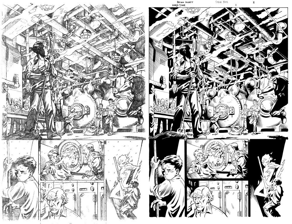
 I thought I'd post some original pencils and then inks, mainly because I love seeing this kind of thing. What we have above is my pencils for issue 1 of Hard Time: Season Two followed by Steve Bird's inks and Lee Loughridges colors. I particularly like how he handled the flashbacks in this issue (you'll have to buy the issue to see what I mean). I was really excited to get Lee on this book--I really loved his stuff on Gotham Central. It was also great to have Steve Bird come on as the regular inker after his fill-in on ish 12 of the original series. I had been really happy with his work on that issue and I realized that I could use some longer term help on the book. Trying to pencil and ink a monthly book was really starting to wear on me. We had a short hiatus between issue 12 and this issue. In fact, it had been almost two months since I had drawn Ethan & Co. By the time I received this script I was well rested and ready to dive back in. I had a lot of fun doing this one and I also think it's one of Steve Gerber and Mary Skrenes' (co-writer) better issues.
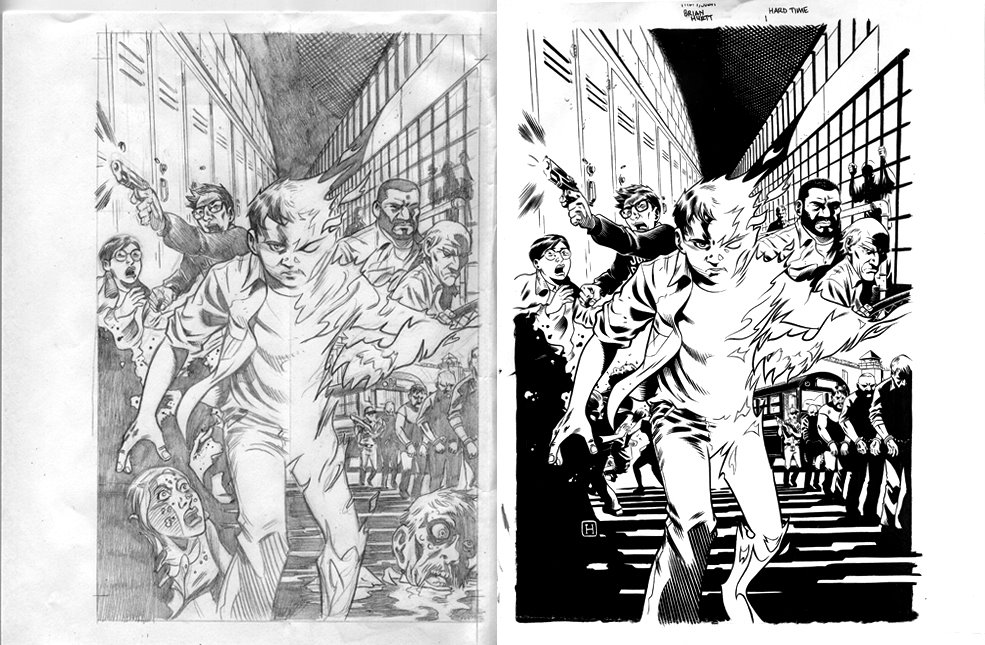
Below is the original pencils for the cover to issue #1. I almost always do all of my covers and my splash pages on 8 1/2 x 11 copy paper and then blow it up, lightbox it and then ink it. This was no exception. Sometimes I even work at half that size. I've moved to working almost exclusively at that size for my regular pages as well. When I work larger the image often becomes to unwieldy for me and I can lose control of proportions and such. I've always drawn pretty small and trying to make that transition when I started doing comics was very difficult. I'm much more comfortable now at the larger size but I still prefer to work small. Working small also makes my work much more portable.
You'll notice the extra elements of the image in the bottom corners of the penciled version. It was pointed out to me, and rightly so, that these distracted from the central image of Ethan and also made the page just too crowded. You can see how they just weigh the image down and draw your eyes to the bottom of the page.
I know the book is coming out tomorrow, but you can still go read the 6-page preview here if you'd like.

4 comments:
I... I hate you.
Cool to see the process, I've thought about working small and I probably will once I get more comfortable with my inking.
nice to see you blogging....
missing you...:P
Chip
Hi, I was out blogging and found your site. It certainly got my attention and interest. I was looking for Cases information and even though this isn't a perfect match I enjoyed your site. Thanks for the read!
Post a Comment