Showing posts with label The Damned. Show all posts

Thursday, October 04, 2012

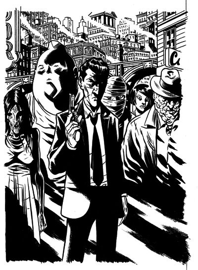
Big DAMNED Commission!


click above image to enlarge!
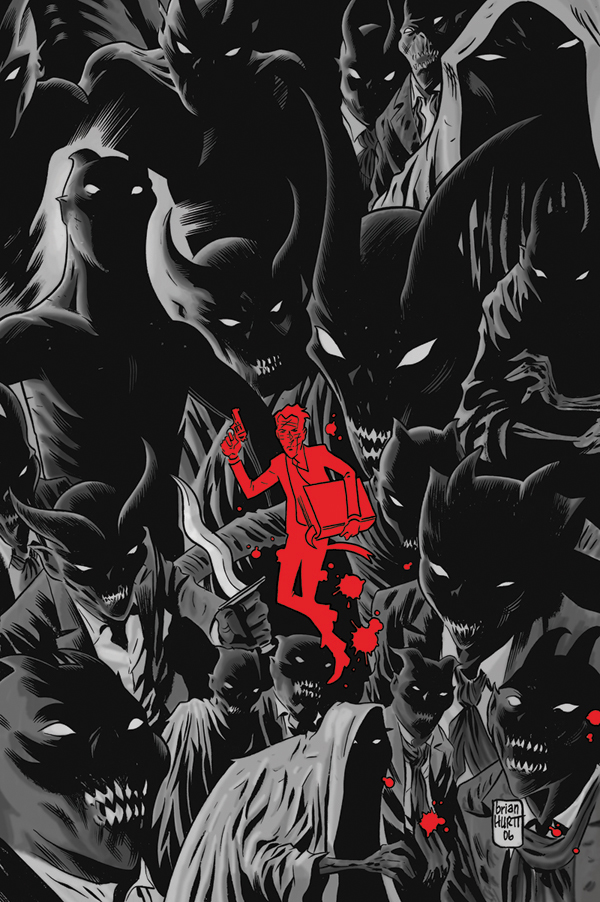
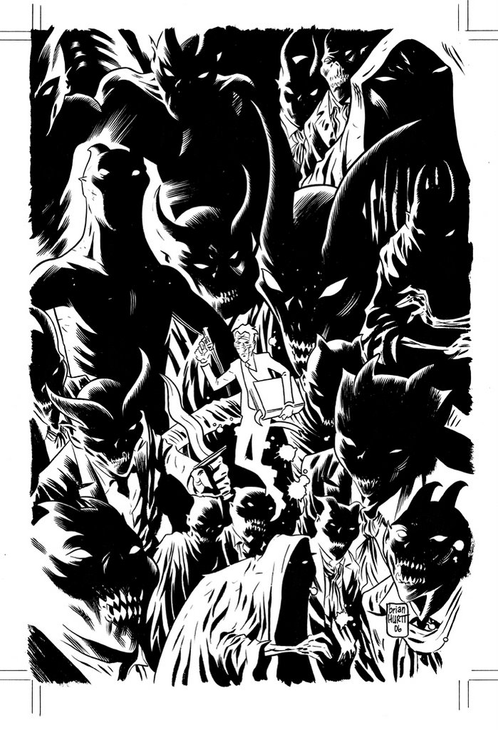
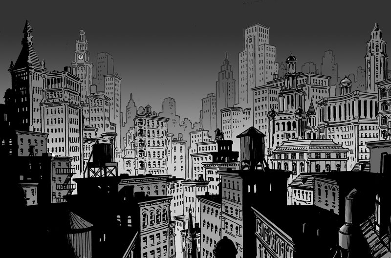
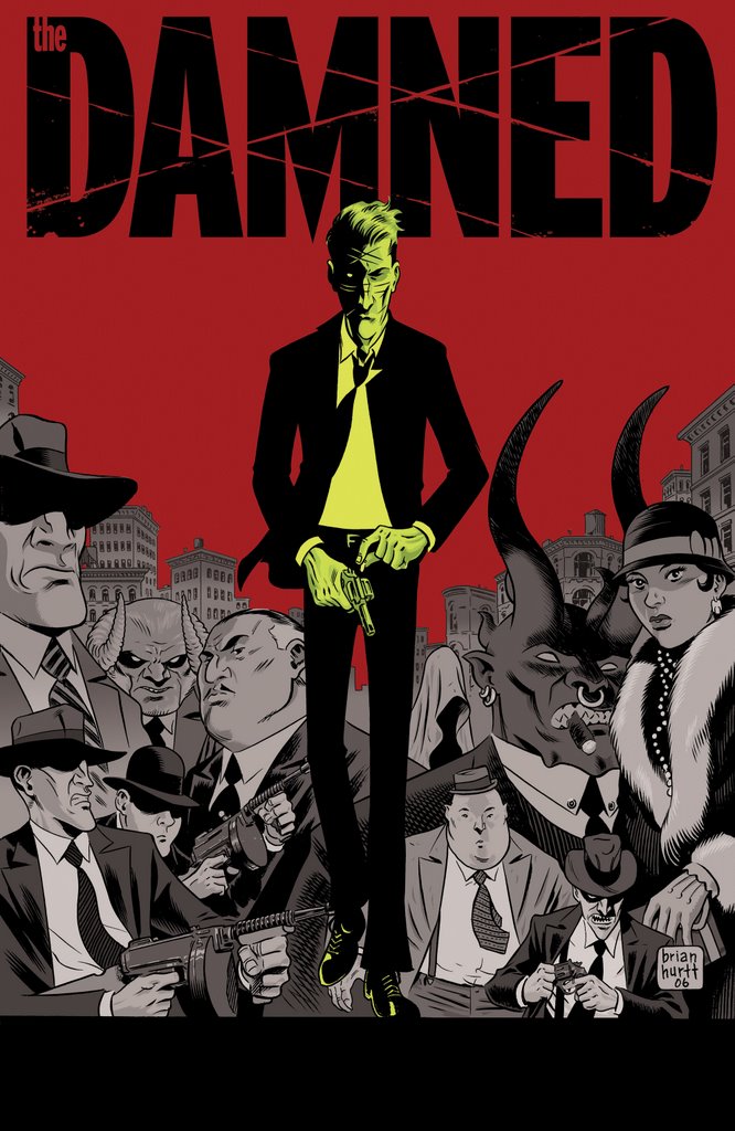
Maybe my favorite commission I've ever done.  I can't believe I never posted this--it was done over two years ago! This piece was intended to have a noir movie poster vibe.  It's a larger piece than I normally do as it is on 18"x24" Bristol.  As with all my commissions it is all done by hand, including the red (I believe it was a water acrylic that was used).  Also, if memory serves, I did the line art on the background buildings in pen (either Microns or PITT) and all the foreground elements are brush and Sumi ink.  Tones, as always, are ink wash.
Below is the initial sketch, the rough pencils, rough pencils with logo blocked out and rough pencils with tones.


Monday, January 19, 2009

Some Damned Praise!


Many, many thanks to the fine folks over at The Quarter Bin! They've just released their list of "Comics of the Year--2008" and saw fit to name The Damned: Prodigal Sons one of their "Best Mini-Series". Pop on over to check out the rest of the list.
Here's what they had to say about The Damned:


"I loved the first
Damned mini, and when this sequel came out, it not only lived up to the original, but surpassed it. Cullen Bunn and Brian Hurtt expanded on the mythos of their demon-infested 1940s in a way that not only made me want to see more of this world outside of Eddie, his brother, and the mobster monsters of his city, but had me hanging on the edge of my seat at the end of each issue. I was first introduced to Brian Hurtt during his stint on Queen and Country, and while the guy was good then, his work on this series establishes him as one of the best independent artists working today. His crisp black and white art creates an atmosphere that invokes some of the great noir detective/mystery flicks, and his work is totally worth the wait between series. Cullen Bunn’s scripting is sharp, smart, and would translate well to any medium. I’m just thankful we’ve got him in comics. You’d be a fool to not track this book, or the original mini-series, down at your LCS if you missed out on it."

Thursday, June 05, 2008

Reeee-Mix!


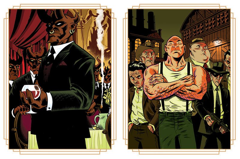
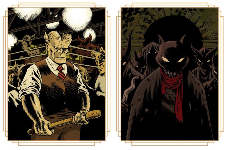
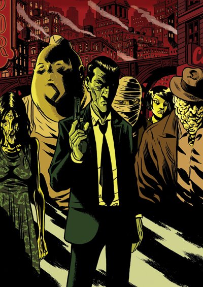
More cartoony stuff from the ol' sketch pile. Looking for something to doodle, I decided to revisit characters I've already done in comics except to imagine them in my more cartoony style. The above are obviously characters from the "Damnedverse". I'm especially fond of the Verlochin in the bottom right corner.
Below are drawings of characters from Three Strikes(Oni Press), Skinwalker(Oni), and Hard Time (DC). Most of the characters are from Hard Time. As I got into drawing them I was reminded how much of an ensemble book that really was. There are several characters I didn't even get around to drawing.
Also, that guy at the bottom center of the page is supposed to be young Crocker from Queen & Country: Declassified.

Wednesday, January 30, 2008

Damned Again

(click-it to enlarge-it)

This is a couple months old at this point but I thought I'd share it anyway. This is the first cover to the 3-issue follow up to the Damned, subtitled Prodigal Sons. As the hand in the lower right indicates, this cover is not just an example of poor composition but it's also the first image in a triptych (all three covers form one big image). Keep an eye out for this book--it hits sometime in March.

Thursday, April 19, 2007

The Ol' Wraparound


I had the bright idea that I wanted to redo the cover for the upcoming The Damned trade paperback. The plan was to use the cover from issue one for the trade cover but I did have some minor quibbles. The "major" minor quibble was that the original cover was too still--it didn't get across any sense of action or kineticism (did I make a word up?). My solution was to make Eddie larger and coming at the reader/viewer. So far so good. But why stop there?Why not do a wraparound cover? I've always wanted to do a wraparound but have never had the opportunity. That gave me a whole new dilemma: How do I take an image that was designed to work as a vertical cover and make it work as one half of a larger horizontal cover? How indeed? After much trial and error I came up with the image below. Drawn in pen on two pieces of 81/2" x 11" copy paper. Image size--approximately 13" x 9".


Once the fun part was done it was on to the drudgery of enlarging and lightboxing the image. I drew it lightly with a harder lead (2H I believe) so I apologize for the miserable scan. Perhaps if you click on it to enlarge it will be easier to view. Perhaps.
That done, it was on to inking. That's funner part...yes, funner (get off my back, I know the proper grammar is funnerist).
This is where the piece really comes together for me.


And finally, the colors. Oh, the colors. This was the most difficult part...but only because I had no idea what I was doing. I knew all along that I was going to keep the original color scheme from the issue one cover. Only, I was also aware that I never would have used those colors had I originally intended to make a full-blown wraparound cover. It's too difficult, in my mind, to carry that color scheme through a large "montage-y" piece. But I tried. I'm fairly happy with the final product and I'm completely jazzed about attempting another wraparound--this time working from the ground up.


Thursday, April 05, 2007

Damned Portrait #3


Cleaning out the blog dust bin and found this. (from 02/27/06)

Wednesday, January 24, 2007

Damned #4 Cover


I realized that I hadn't posted this cover image yet, so, seeing as it's out (today!) I thought I'd throw this up. I had a lot of fun with this cover--the background demons were fun to draw and the inspiration for doing the cover this way came from this Dr. Fate commission that I did.

Sunday, January 21, 2007

Animated Damned

Okay. Sure, it's not the Cartoon Network show I hoped for but I still think this animated GIF is pretty cool. And if you think The Damned is pretty cool, and I know you do, then you need to right click, save, and post somewhere where others will see it and love it.
I have a slew of posts comin' at ya'--and by slew, I mean at least 4 or 5. I've been having scanner issues but they're resolved and I have a handful of commissions I'll be posting. Stay tooned.

Sunday, September 17, 2006

The Best Bad Review

"This book has some really nice art and monster designs from Hurtt and is paced to perfection."

Let us hope any future bad reviews are so glowing.
Comics-and-More gives The Damned a "C". If this were school I'd see the teacher after class and argue for a "B-", at least. You can read the review here.

Wednesday, September 13, 2006

"Guy Davis-meets-Ditko-meets-Joe Staton-meets- Wally Wood-as-inker" or...More Reviews


The title line above is, by far, the coolest thing anyone has ever said in a review about my art. You can read that review at The Johnny Bacardi Show here.
Also, check out Around Comics who have posted their early review of The Damned right here.
The Good News continues in the HollywoodJesus review that takes a look at our book from a Christian viewpoint.

For all you cynics who are wary of all the positive reviews I promise that I'll post any negative reviews that come my way. I might wait until next year, but I'll post them.

Monday, September 11, 2006

Banner Ad and DAMNED reviews!

Above is the banner ad I put together to appear as an ad on Comic Geek Speak's site. I hope to see this popping up around the web. Please feel free to use this willy-nilly.

Speaking of Comic Geek Speak, my cohort and creative dynamo, Cullen Bunn, recently did a podcast interview with the CGS crew. Drop in and give it a listen, but be sure to link to it through Cullen's site first where you can read his brief self-critique.

Last, but not least, a couple of reviews have already started to pop up--I can only pray that the tenor of all future reviews is about the same. Take the time to check them out here and here!

Ooh! One more quick thing! Wasteland #2 came out a couple weeks back and the 6-page preview was in the back. Unfortunately, the local comic shops are sold out so I've yet to see it. I'm dying to see how the pages look in print. Cullen has already seen the book and has told me that the pages actually look better in print than they do on the 'puter. I hope that's the case--I've been nervous about how the grey tones would reproduce. Fingers crossed. Has anyone out there seen this? What do you think?

Friday, September 08, 2006

DAMNED #2 cover


Long time, no see. I've yet to get my main computer hooked up to the internet so all blog updates go through my laptop still and are posted from public places. It's a bit of a hassle but I think posts will begin to appear more frequently.
Been meaning to post this image for a while now. It's the actual cover to The Damned #2. It was solicited in this month's Previews with the original cover to #1--not the alternate cover that was solicited with #1 or the actual cover to #1. You follow? I'm not even sure I do. Anyway, here it is, in all it's digital glory. I'm quite fond of this image, actually. I've had the image in my mind for about a year and it was great to finally make it real. I'm having a blast doing the covers and I'm really learning a lot about my own ideas about color. This cover and the cover for #3 (which I'll post when the next previews comes out) are both examples of final colors that in no way resemble my original intentions. In both cases I tried coloring it the way I saw it in my mind's eye only to see that my mind's eye may be color blind. I then start playing with and experimenting with different color combinations until I stumble across something that gives me a visceral reaction. The color scheme may not be for everyone but I'm fairly happy with how it turned out. Just the same, I'd love to hear what people think--good or bad!

Click to enlarge

Tuesday, August 15, 2006

Teaser Time!

Cullen and I recently cranked out a 6-page, all original, teaser for The Damned. This teaser will not appear in the comic but acts as a kind of prologue to the upcoming story. It is viewable at Newsarama along with the accompanying press release for the book. You can also view it in pdf form on the Damned page of the Oni Press site, here. The teaser will be appearing in upcomng books from Oni, beginning with Wasteland #2 (due out tomorrow!). Let me know what you all think! Stay tuned for a preview of the first issue--it'll be posted online sometime in the next couple of weeks.

Thursday, August 10, 2006

Order Now!

THE DAMNED #1
By Cullen Bunn & Brian Hurtt

During the prohibition era, gangsters grew rich on our vices, and rivalries between criminal organizations resulted in open war. But unknown to the masses, a more sinister power controlled the crime cartels, using greed, gluttony, lust, and other sins to fuel a much more lucrative trade: mortal souls. Three demon families—the Aligheris, the Roarkes, and the Verlochin—control soul-trafficking within the city, capitalizing on “the rackets” to lead unfortunates into their grasp and poor Eddie is caught in the middle…

40 pages, black & white
Contains harsh language and mature situations.
In stores: October 18, 2006
$ 3.50 US, $4.00 Can

In Previews now! Order code is AUG06 3487--tell your local retailer!

Also, we now have a sign-up on the Damned website for our Damned newsletter. Sign up now and be entered in our raffle for original art. I haven't decided what it'll be yet but I promise it won't suck. We'll be sending out the newsletter probably about once a month (we won't be clogging up your inbox) and we also plan to do a drawing every month for free swag. Drop by, sign-up, and be sure to order The Damned #1.

Wednesday, August 09, 2006

DAMNED Postcards--The Final Four

Long time no see! It's been a crazy month here in the Lou (St. Louis for those of you not in the know). Been finishing up the first issue of the Damned, doing covers, redoing covers, prepping for Wizard World Chicago, doing promitional art, and not least of all, packing up all my junk and moving across the river to Illinois. My computer has been disconnected from the internet for a week and a half and it took my thick skull almost that long to buy a jump drive, enabling me to move files from my desktop to my laptop. So here I sit in my local cafe (god bless the free wireless) and updating my blog...sometimes I love living in the future.

So, at long last, here are the final four postcards from my 5-card Damned postcard set. I put these together specifically for Wizard World and any upcoming shows or signings I might attend. It's a limited run of a hundred and if anyone interested can contact me through this blog or the official Damned website. $10 dollars a pop includes shipping and a quick sketch.


Monday, July 24, 2006

DAMNED Postcard w/ Color

Here's the color final of the postcard I posted previously. As I had mentioned previously, this is one of a set of five--I'll be sure to post the other four later this week.

Monday, July 17, 2006

DAMNED postcards


It has been an insane couple of weeks. Been workin' an average of twelve hours a day with my only break being the two days I spent in a medical study (the things a freelancer will do for his art). Anyway, I've finally finished the art, tones, and letters for the first issue (40 pages! Same low price!) of The Damned. I also completed an original, last minute, 6-page preview that Cullen and I threw together and will be appearing in the back of Wasteland #2 next month. I'm pretty happy with the way that turned out (more on that later). I'm now preparing for the upcoming Wizard World show in Chicago. Had a lot of big plans, but, due to time constraints it looks like I'm going to settle for doing a set of five postcards in support of The Damned. They're all drawn--I just need to color them this week. In the meantime I thought I'd share one of them with you. I'll definitely post the other four in the next week or so.

Wednesday, July 05, 2006

DAMNED pages

Here are the first three pages of my upcoming comic The Damned. I plan on posting more pages in the future, I just need to figure out whether I want to post consecutive pages or just a random sampling. These three pages have been around for a long time. Along with the following 5 or 6 pages they were originally drawn on copy paper with roller ball and Micron pens. I was going for a quicker, more immediate style. It looked fine but when I decided to use a brush on a later page I realized how inadequate the previous pages looked. So, I went back and redid them in brush. That went fine for a while until I realized I had the wrong ratio for the pages (it's a long complicated math story that involves the change in format from digest size to floppy size) . So, I went back again and redid them, this time making the pages a little more narrow and a bit taller.
Truth is, this third page has been drawn and inked at least five times. Because, I had been working on this book in fits and starts over the last year my style had changed slightly as had the design of this guy, Eddie, our main character. I keep assuring my partner on this book, Cullen Bunn, that I will not be this neurotic come the second issue (if I want to watch his blood pressure spike I tell him that I'm thinking of redoing this or that page). He's much more at ease now that the art for the first ish is complete (40 pages!). All that's left is the lettering.
Stay tuned--I'll have more pages up in the next week!