
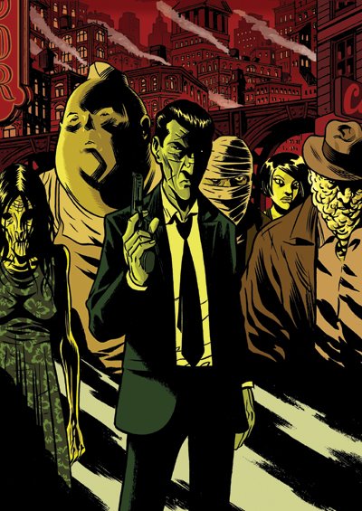
 Here's the color final of the postcard I posted previously. As I had mentioned previously, this is one of a set of five--I'll be sure to post the other four later this week.
 Monday, July 24, 2006
DAMNED Postcard w/ Color
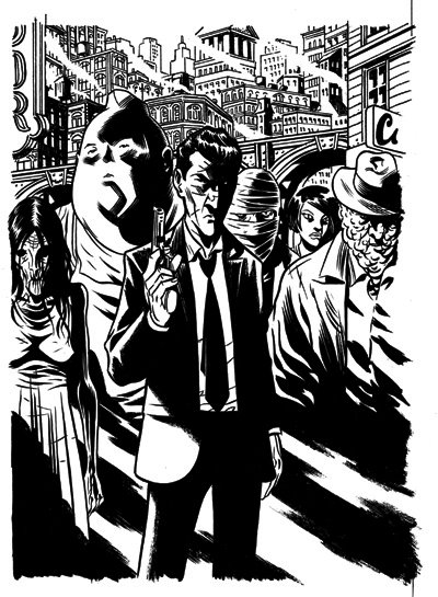
Here's the color final of the postcard I posted previously. As I had mentioned previously, this is one of a set of five--I'll be sure to post the other four later this week. Monday, July 17, 2006
DAMNED postcards

It has been an insane couple of weeks. Been workin' an average of twelve hours a day with my only break being the two days I spent in a medical study (the things a freelancer will do for his art). Anyway, I've finally finished the art, tones, and letters for the first issue (40 pages! Same low price!) of The Damned. I also completed an original, last minute, 6-page preview that Cullen and I threw together and will be appearing in the back of Wasteland #2 next month. I'm pretty happy with the way that turned out (more on that later). I'm now preparing for the upcoming Wizard World show in Chicago. Had a lot of big plans, but, due to time constraints it looks like I'm going to settle for doing a set of five postcards in support of The Damned. They're all drawn--I just need to color them this week. In the meantime I thought I'd share one of them with you. I'll definitely post the other four in the next week or so.
Wednesday, July 05, 2006
DAMNED pages
 Here are the first three pages of my upcoming comic The Damned. I plan on posting more pages in the future, I just need to figure out whether I want to post consecutive pages or just a random sampling. These three pages have been around for a long time. Along with the following 5 or 6 pages they were originally drawn on copy paper with roller ball and Micron pens. I was going for a quicker, more immediate style. It looked fine but when I decided to use a brush on a later page I realized how inadequate the previous pages looked. So, I went back and redid them in brush. That went fine for a while until I realized I had the wrong ratio for the pages (it's a long complicated math story that involves the change in format from digest size to floppy size) . So, I went back again and redid them, this time making the pages a little more narrow and a bit taller.
 Truth is, this third page has been drawn and inked at least five times. Because, I had been working on this book in fits and starts over the last year my style had changed slightly as had the design of this guy, Eddie, our main character. I keep assuring my partner on this book, Cullen Bunn, that I will not be this neurotic come the second issue (if I want to watch his blood pressure spike I tell him that I'm thinking of redoing this or that page). He's much more at ease now that the art for the first ish is complete (40 pages!). All that's left is the lettering.
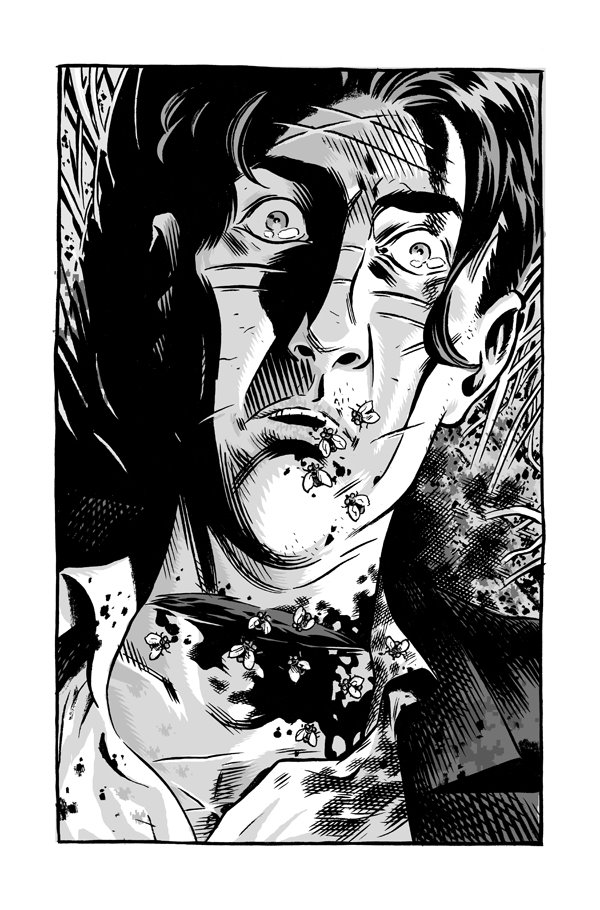 Stay tuned--I'll have more pages up in the next week!
Sunday, July 02, 2006
Oh, Death
I recently completed a commission for someone featuring Vertigo's character, Death. I've always loved this character, and was especially a big fan of the first mini-series, Death: the High Cost of Living. At the time I was a huge fan of the artist Chris Bachalo. I think at that point he was mainly associated with another Vertigo title, Shade: The Changing Man. He has since diminished a bit, in my eyes, as his art drifted further and further towards a more pop/graffiti style that gives me a headache to look at. Can't blame an artist for growing and evolving, it's just that in this case he move further away from my aesthetic tastes. But, I digress...
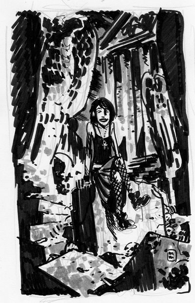
So given this commission I started of by doing this very small, very ruff, marker sketch:
 Being fairly happy with the general composition I moved on to creating a slightly tighter marker sketch done to scale of the final image size. Knowing that I wanted her amongst some decay and ruin I did a little research to find some Egyptian imagery. The columns should be historically accurate and the toppled statue in the background is the Egyptian god, Anubis. To my understanding, Anubis was the guide to the underworld, the one who would sheperd the souls to Osiris, the God of Death. Apparently, early Egyptians worshipped Anubis as the original God of Death before Osiris came along and his position in the pantheon was "downgraded". Of course, I'm kinda talking out my ass here so feel free to correct me if I'm wrong.
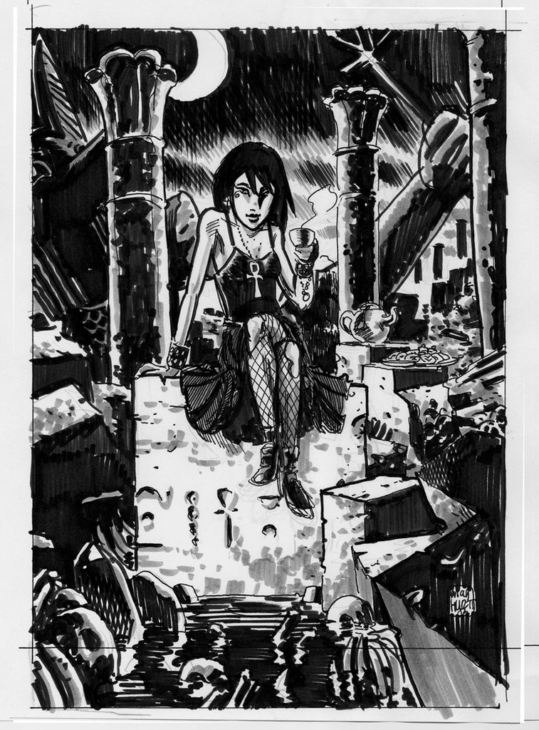 And, the final. Done on 14" x 17 " Bristol board in Sumi ink and grey PITT brush pens. The grey pens were a last minute addition. I had intended to have the image be black and white, but after dong the sketches with grey tones the final just looked like it was lacking something. I had never used the brush pens on an image this large or for something that was going to someone else. I was really afraid that I would mess it up and have to start all over. Fortunately, I think it turned out pretty good.
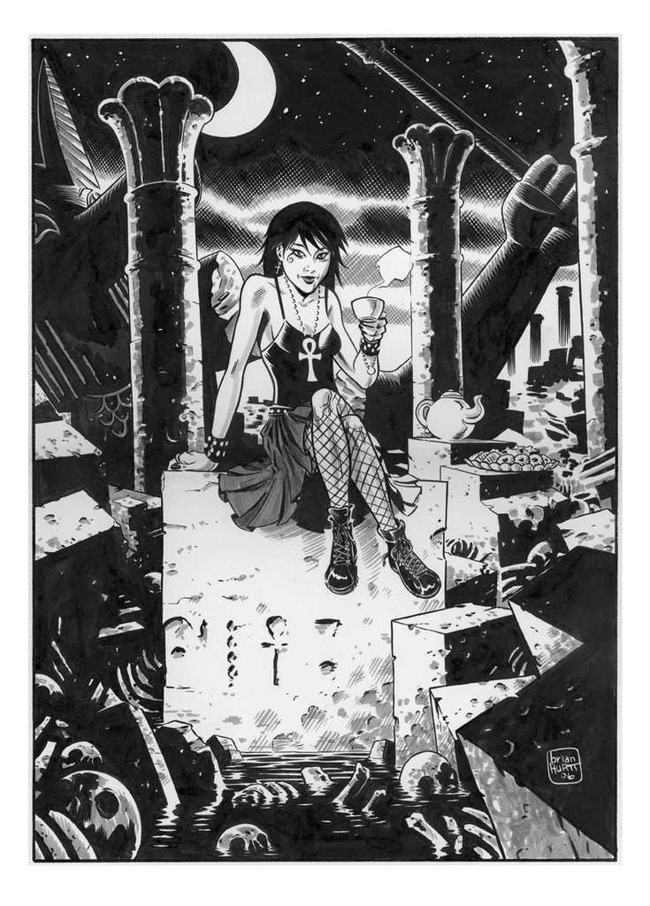 click to enlarge
Subscribe to:
Posts (Atom)