Thursday, December 29, 2005

Snow Camels and Frog Pirates

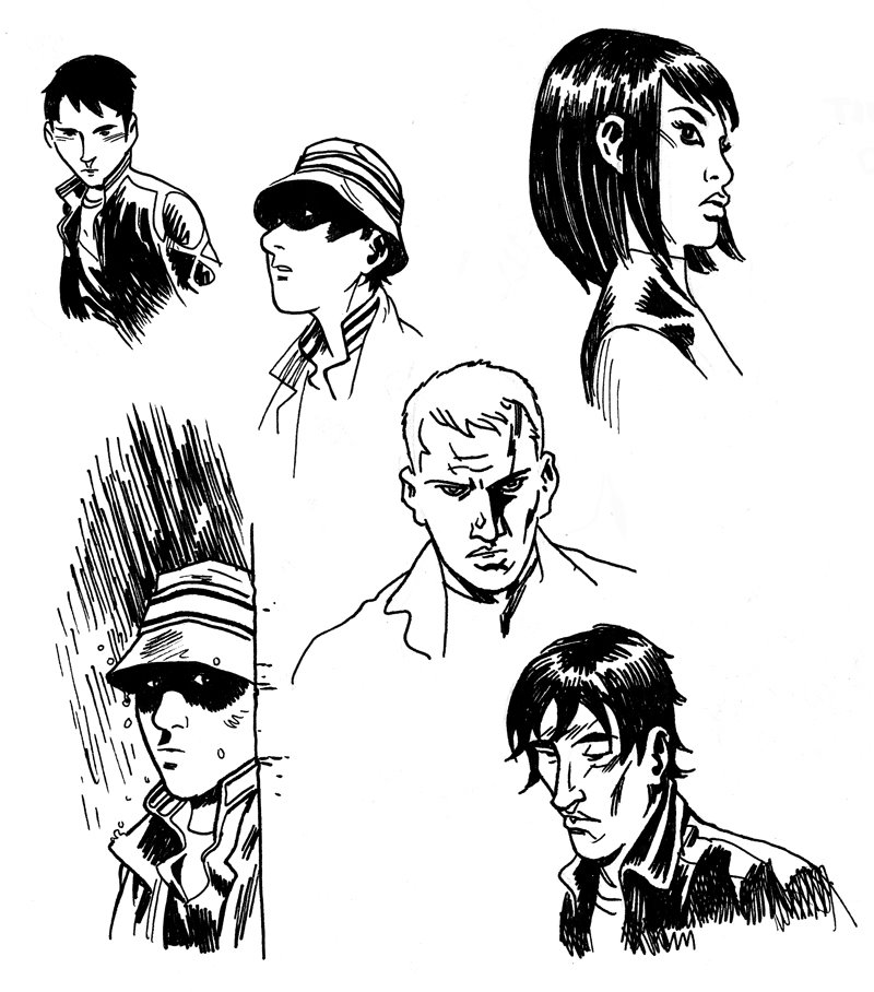
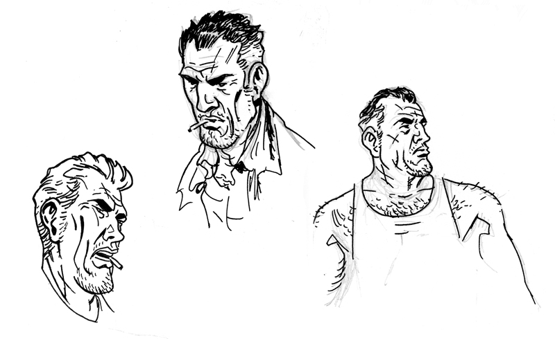
In my last post I said I'd post more of these drawings that revolve around this "all ages" story of mine. The following two pages were cobbled together sketches that I had put into a last minute con sketchbook to take with me to Chicago last summer.
Do be sure to click on the image so you can see it a little better.
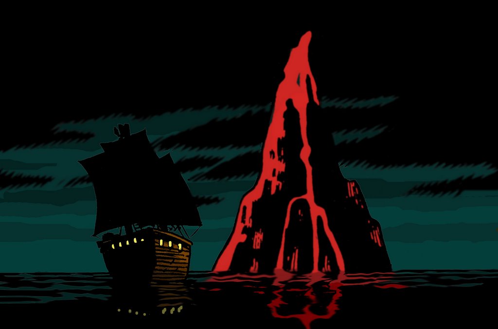
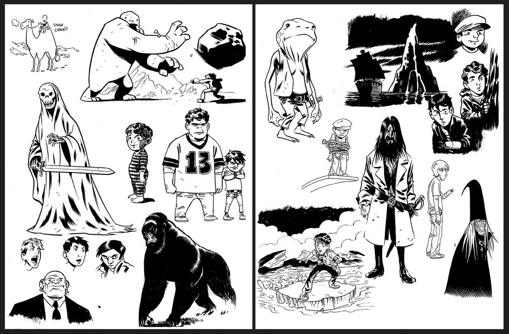
The title of the post indicates two of my more favorite sketches/ideas on these two pages. I love the idea of a snow white camel trudging across an arctic landscape with it's breath steaming up (upper left corner). A friend suggested that it have hot chocolate in it's hump instead of water. I'd had the same idea but, unfortunately, I think it's too unrealistic for this world I'm building. Frog pirates, on the other hand, make perfect sense. The frog pirate seems to be a favorite of a lot of people. He's part of a larger crew of enchanted pirates that also include a gerbil and a mouse. It all makes perfect sense in the story, of course. I had imagined the gorilla walking the halls of a castle, possibly as a guard. Then, I was recently at the comic store looking at Tintin books when I ran across the same image. I think it was in The Black Island--curses on you Herge! Whenever I think of this story I imagine it being presented in the classic European album style like the Tintin or Asterix books, for example. Ah, to dream...
You can be sure to see more of this style from me in the future. Of course, until I can find someone willing to pay me to draw like this you'll just have to keep coming back here to see it.


Tuesday, December 27, 2005

Tree Fort

This sketch is of some kids I have in mind for a story that I'll some day get around to doing. It's sort of a Narnia meets Goonies thing that's been floating around in the back of my brain for a year or so now. I included some sketches along these lines in my 2005 Convention Sketchbook. I think I'll probably post those pages later this week. I knew they had a cool tree house but this is the first time I've gone about drawing it. I'm sure it'll see many variations over time. The labeled items (kind of a Richard Scarry homage) are different things you'd find in a kids bag if he were packing for an adventure. I used to pack a twelve foot length of rope--just in case I needed to swing back and forth under a low branch. I decided not to include that. Because these kids are dorky I probably should've packed their D&D Monster Manual.

Friday, December 23, 2005

Q&C #29: Cover Process

I recently did a cover for the Oni comic Queen & Country #29(with which I have a history). I was real gung-ho to do this project. I'm a big fan of the series and I was really excited about the opportunity to draw Tara Chace again and to do it in full color. I started out with four thumbnails (I apologize for not showing them here--I can't find them anywhere) and then the editor and I narrowed it down to two images. I then did tighter pen sketches of those two images (see above). (Note: those sketches were about 5"x7.5" and done using the fabulous Uniball Vision pens). At the same time I sent those in I sent in color treatments on both so they could see where I was planning on going with them.

I was really on the fence about which of the two covers I preferred. I really liked the surreal, spooky ambiance of the jogging image but at the same time I liked the iconic portrait shot of Tara. It was decided that the portrait worked better as a cover image and I think I agree with that.I went ahead with the final and as you can see it's really no more than a cleaner, slicker version of the pen sketch.


It's not usual for so little teaking between a sketch and a final. I even pretty much kept the exact same color scheme. I did send along an alternate monochromatic red version of the same image but it was decided that we'd stick with the original color scheme.

I had a blast doing this for many fanboy reasons but the most significant reason was that this was the first time I've ever seen a piece from start to finish. For good or bad, it was the first time I've ever been able to color a piece the way I wanted to see it. As far as I know I'm supposed to be doing all the covers for this story arc (3 or 4 more issues, I believe) and I'm twitching with anticipation. Twitching, I say!

Thursday, December 22, 2005

What's Black + White and Red All Over?

Here's a commission of the big red guy I did a little while back that I wanted to share with you. In my original sketch I had decided to have Hellboy fighting a crowd of Nosferatu-like vamps(the color image). I ran this by the guy who commissioned it and he really liked the drawing but he asked if I could substitute zombies for vamps. Viola! Hellboy meets Walking Dead! This was a lot of fun to draw. Both because it was my first large scale commission (the final was around 11"x17") and because it was Hellboy, dammit!

Tuesday, December 20, 2005

Colossus

I've had X-Men on the brain lately. I recently saw that X-Men 3 trailer (fastball special!), I just read the second trade of Joss Whedon's run on Astonishing X-Men, and I'm in the middle of revsiting my childhood through Uncanny X-Men Essentials--the volume that covers the Mutant Massacre era. Hence the Colossus sketch.
Plus, Colossus is just awesome.

Friday, December 16, 2005

Pen Sketch

Below is just a random sketch I did last night to unwind.

It's been a real bummer of a week for me. A couple days before Halloween I had woke up with a stress fracture in my foot. It was intensely painful and just as intensely annoying. I had to move in with my folks for a couple weeks because living alone in a third floor walk-up and driving a manual transmission are not compatible with getting around on crutches. Simple things like carrying a coffee or a plate of food from the kitchen become impossible. Anyway, several weeks later and I was doing much, much better. I was walking and driving and driving again with no other aid than a slip-on brace for my foot. Then, deja vu, I woke up Wednesday morning in intense pain. It seems I've refractured my foot while sleeping again. Cruel, cruel world.
Just wanted to vent a bit...and maybe elicit some sympathy. I love sympathy.

Thursday, December 15, 2005

The Boy Who Survived

I'm a big Harry Potter nut. Unapologetically so. I've read all the books--the first four I've read twice. And who knows how many times I've seen the movies. The new movie is fantastic , by the way. I still might like the Prisoner of Azkhaban better but it's pretty close. Anyway, just wanted to share this quick sketch I did. I have a lot of fun drawing in this slightly simpler more cartoony way. I'll have to post some other sketches in this style in the near future.

Tuesday, December 13, 2005

Venti Non-Fat Vanilla Latte, Please

This sketch was inspired by this cute teen I saw at the local Starbuck's.

Editor's note: It's was pointed out to me by a friend of mine that I may have come across a little like a creepy old man with this post. When I said "cute teen" I had only meant was that she was cute in that adorable,"if-I-had-a-daughter-I-would-hope-she-was-cute-like-this" kind of a way. Honest-to-Betsy.

Monday, December 12, 2005

Headshots


These are just some random sketches I've done over the past week that I felt like sharing. The character below was just me riffing on a private detective character I've had in the back of my mind for years now.
As always, click to enlarge.

Sunday, December 11, 2005

Cover Process: Hard Time #1

Before I ever started doing cover sketches for Hard Time: Season Two, issue #1, I did a few rough mock-ups as a suggestion for new cover design (one of which is shoen to the left--the issue number and imagery are completely arbitrary). We knew we were ditching the other cover design due to it's connection with the now defunct Focus line. For the new cover I wanted a BIG, BOLD, in your face logo and the letterbox design. They kept the letterbox look but had to shoot down the idea to change the logo. That made sense, of course. After being off the shelf for almost a year we needed to be sure that any logo recognition we may have built up in the first 12 issues needed to be maintained.

I actually worked out all of the following cover sketches before seeing a script for issue one. Being that it was a first issue we didn't need a cover that was story specific, it just needed to be representative of the series. A) it needed to feature Ethan B) it needed to feature his Khe-Chara(his super-power, or KC as we call it) and C) it needed to feature the prison setting or prison iconagraphy. Using those guidelines I came up with these following cover sketches ranging from not very good to plain awful. Actually, I kinda liked the one of Ethan and his KC facing the camera with the montage broken up by prison bars.


Here's a color version of that montage cover...


But, this was my favorite cover sketch.


Then after getting the script I worked up the following sketch. You'll notice that the cover that hit the stands was basically this one with some adjustments. Today was the first time I'd seen this sketch since I originally did it (last Feb/Mar?). I'd completely forgot that the initial sketch looked like this.

Tuesday, December 06, 2005

Pencils and Inks and Colors, Oh My!


I thought I'd post some original pencils and then inks, mainly because I love seeing this kind of thing. What we have above is my pencils for issue 1 of Hard Time: Season Two followed by Steve Bird's inks and Lee Loughridges colors. I particularly like how he handled the flashbacks in this issue (you'll have to buy the issue to see what I mean). I was really excited to get Lee on this book--I really loved his stuff on Gotham Central. It was also great to have Steve Bird come on as the regular inker after his fill-in on ish 12 of the original series. I had been really happy with his work on that issue and I realized that I could use some longer term help on the book. Trying to pencil and ink a monthly book was really starting to wear on me. We had a short hiatus between issue 12 and this issue. In fact, it had been almost two months since I had drawn Ethan & Co. By the time I received this script I was well rested and ready to dive back in. I had a lot of fun doing this one and I also think it's one of Steve Gerber and Mary Skrenes' (co-writer) better issues.

Below is the original pencils for the cover to issue #1. I almost always do all of my covers and my splash pages on 8 1/2 x 11 copy paper and then blow it up, lightbox it and then ink it. This was no exception. Sometimes I even work at half that size. I've moved to working almost exclusively at that size for my regular pages as well. When I work larger the image often becomes to unwieldy for me and I can lose control of proportions and such. I've always drawn pretty small and trying to make that transition when I started doing comics was very difficult. I'm much more comfortable now at the larger size but I still prefer to work small. Working small also makes my work much more portable.
You'll notice the extra elements of the image in the bottom corners of the penciled version. It was pointed out to me, and rightly so, that these distracted from the central image of Ethan and also made the page just too crowded. You can see how they just weigh the image down and draw your eyes to the bottom of the page.
I know the book is coming out tomorrow, but you can still go read the 6-page preview here if you'd like.

Get a Haircut

Just found this and thought I'd share it with you to commemorate the first issue of Hard Time: Season Two coming out tomorrow. I did this page of Ethan headshots right before starting on the first ish. This page was done in an attempt to convince everyone involved that I could give our main character a haircut. I thought Ethan needed to look a little older--a little harder. It was agreed to and so I sheared Ethan's big, boyish, floppy locks.

Saturday, December 03, 2005

Queen & Country Bookplate


I was recently commissioned by writer Greg Rucka to do a bookplate for his new Queen & Country novel Private Wars (a great book!). The bookplate is part of a limited offer that Greg has for his readers through his website. His only instruction to me was to keep the same general design that Steve Rolston had used when he did the bookplate for the first Q & C novel. Otherwise, I was given free reign. Greg wanted me to have fun with it and do whatever I liked. Even so, I still ran a few quick sketches by him before settling on the final. I had a lot of fun doing this as it was my first chance to draw Tara Chace in over three years. Plan on seeing a little more Tara from me in the coming months. I'm going to be doing a few upcoming covers for the Q & C comic for Oni Press. I'm pretty excited.

Thursday, December 01, 2005

Hot Damn, Here I Am!

It's finally here! This Wednesday Hard Time: Season Two #1 hits the shelf. I received my complimentary copies in the mail today and they look great! It felt so good to hold something I'd worked on in my hands again--it'd been too long. Although I've been staying busy working on this series (I'm currently working on ish #6), without something tangible to hold onto I've felt disconnected from the industry. The last issue of Hard Time came out in January of this year--I hope everybody who was with us at the end of Season One still remembers the book and returns (bring a friend!).
Need to catch up? Pick up the Hard TIme: 50 To Life trade paperback!

More bad-ass than Avian Flu


A friend of mine is commissioning artists to draw classic Justice Society of America team members. He was kind enough to ask me to do Hawkman. I'm fairly happy with this drawing (which, for me, is saying a lot) but I'm glad I don't have to do a monthly Hawkman book. Trying to constantly fit those wings in a frame would be a nightmare.