
 Before I ever started doing cover sketches for Hard Time: Season Two, issue #1, I did a few rough mock-ups as a suggestion for new cover design (one of which is shoen to the left--the issue number and imagery are completely arbitrary). We knew we were ditching the other cover design due to it's connection with the now defunct Focus line. For the new cover I wanted a BIG, BOLD, in your face logo and the letterbox design. They kept the letterbox look but had to shoot down the idea to change the logo. That made sense, of course. After being off the shelf for almost a year we needed to be sure that any logo recognition we may have built up in the first 12 issues needed to be maintained.
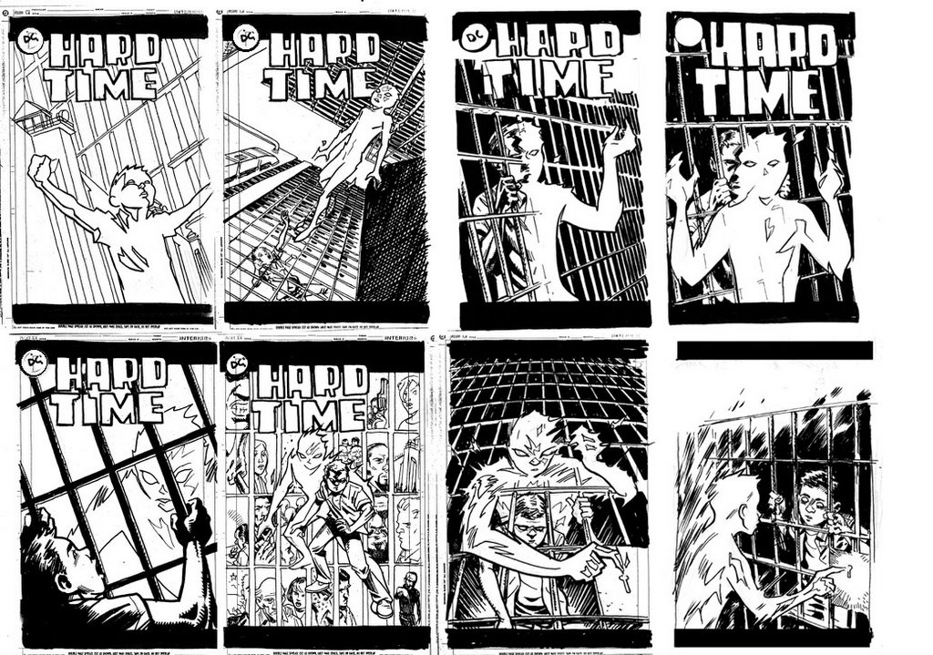
I actually worked out all of the following cover sketches before seeing a script for issue one. Being that it was a first issue we didn't need a cover that was story specific, it just needed to be representative of the series. A) it needed to feature Ethan B) it needed to feature his Khe-Chara(his super-power, or KC as we call it) and C) it needed to feature the prison setting or prison iconagraphy. Using those guidelines I came up with these following cover sketches ranging from not very good to plain awful. Actually, I kinda liked the one of Ethan and his KC facing the camera with the montage broken up by prison bars.
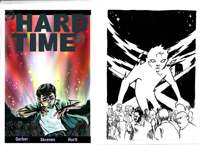
Here's a color version of that montage cover...
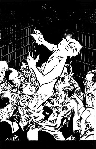
But, this was my favorite cover sketch.
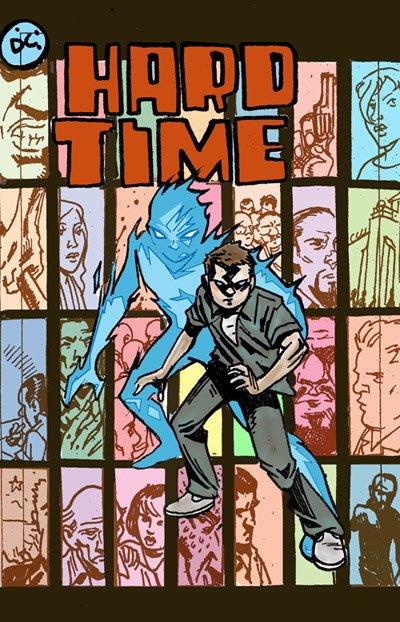
Then after getting the script I worked up the following sketch. You'll notice that the cover that hit the stands was basically this one with some adjustments. Today was the first time I'd seen this sketch since I originally did it (last Feb/Mar?). I'd completely forgot that the initial sketch looked like this.


1 comment:
Hey Brian...gotta say I really liked the cover where he's coming through the bars. It really looks terrific and speaks well to the plot. Maybe you can squeeze that one into a later issue.
-ben
Post a Comment