Sunday, September 17, 2006

There's a Doctor in the House

Thought I'd share with you a couple commissions I recently finished. I always have a lot of fun with commissions, they give me the opportunity to draw subject matter that I may not otherwise have the chance to do. In this case I was particularly happy with the way the Dr.Fate piece turned out. So much so that I'm using some of the design element for the cover to The Damned #4.

The Best Bad Review

"This book has some really nice art and monster designs from Hurtt and is paced to perfection."

Let us hope any future bad reviews are so glowing.
Comics-and-More gives The Damned a "C". If this were school I'd see the teacher after class and argue for a "B-", at least. You can read the review here.

Wednesday, September 13, 2006

"Guy Davis-meets-Ditko-meets-Joe Staton-meets- Wally Wood-as-inker" or...More Reviews


The title line above is, by far, the coolest thing anyone has ever said in a review about my art. You can read that review at The Johnny Bacardi Show here.
Also, check out Around Comics who have posted their early review of The Damned right here.
The Good News continues in the HollywoodJesus review that takes a look at our book from a Christian viewpoint.

For all you cynics who are wary of all the positive reviews I promise that I'll post any negative reviews that come my way. I might wait until next year, but I'll post them.

Monday, September 11, 2006

Banner Ad and DAMNED reviews!

Above is the banner ad I put together to appear as an ad on Comic Geek Speak's site. I hope to see this popping up around the web. Please feel free to use this willy-nilly.

Speaking of Comic Geek Speak, my cohort and creative dynamo, Cullen Bunn, recently did a podcast interview with the CGS crew. Drop in and give it a listen, but be sure to link to it through Cullen's site first where you can read his brief self-critique.

Last, but not least, a couple of reviews have already started to pop up--I can only pray that the tenor of all future reviews is about the same. Take the time to check them out here and here!

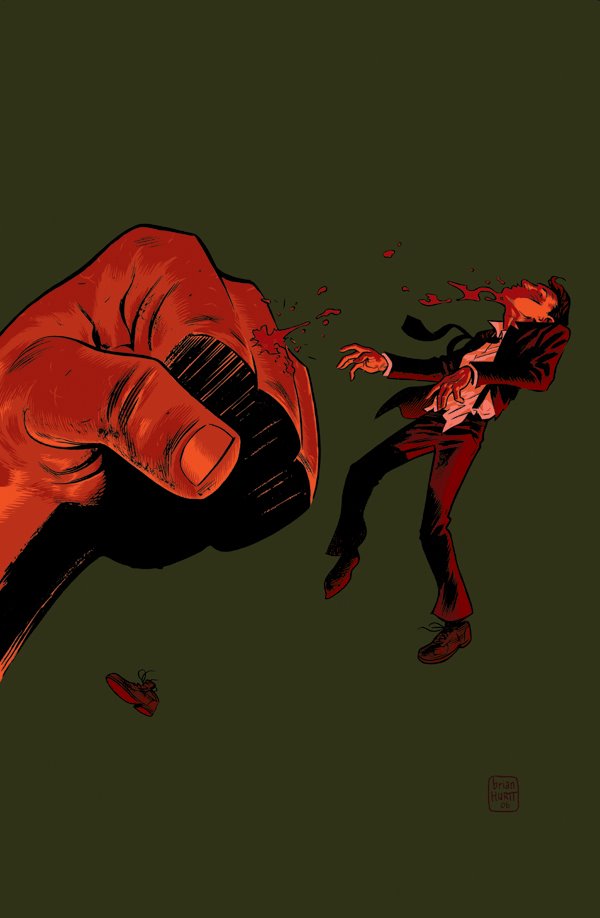
Ooh! One more quick thing! Wasteland #2 came out a couple weeks back and the 6-page preview was in the back. Unfortunately, the local comic shops are sold out so I've yet to see it. I'm dying to see how the pages look in print. Cullen has already seen the book and has told me that the pages actually look better in print than they do on the 'puter. I hope that's the case--I've been nervous about how the grey tones would reproduce. Fingers crossed. Has anyone out there seen this? What do you think?
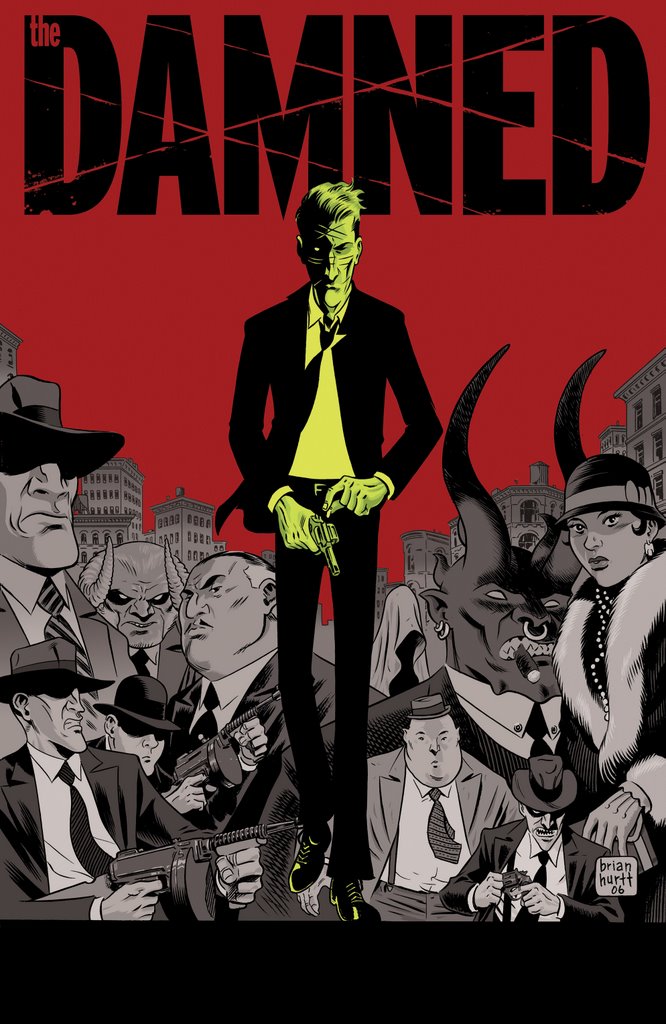
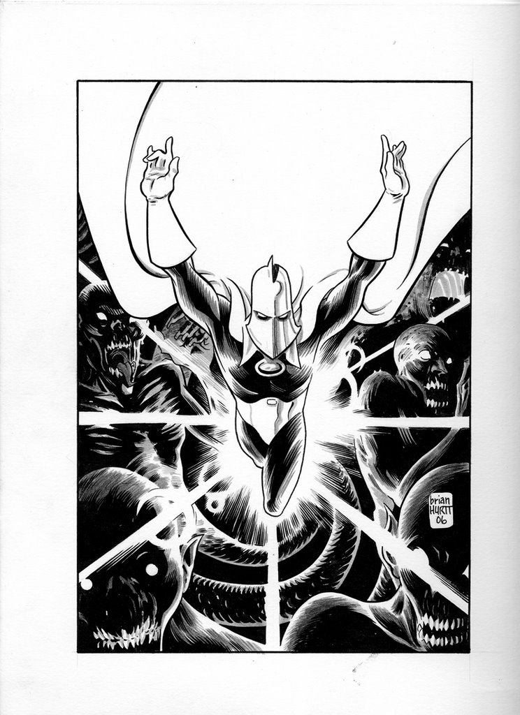
Friday, September 08, 2006

DAMNED #2 cover


Long time, no see. I've yet to get my main computer hooked up to the internet so all blog updates go through my laptop still and are posted from public places. It's a bit of a hassle but I think posts will begin to appear more frequently.
Been meaning to post this image for a while now. It's the actual cover to The Damned #2. It was solicited in this month's Previews with the original cover to #1--not the alternate cover that was solicited with #1 or the actual cover to #1. You follow? I'm not even sure I do. Anyway, here it is, in all it's digital glory. I'm quite fond of this image, actually. I've had the image in my mind for about a year and it was great to finally make it real. I'm having a blast doing the covers and I'm really learning a lot about my own ideas about color. This cover and the cover for #3 (which I'll post when the next previews comes out) are both examples of final colors that in no way resemble my original intentions. In both cases I tried coloring it the way I saw it in my mind's eye only to see that my mind's eye may be color blind. I then start playing with and experimenting with different color combinations until I stumble across something that gives me a visceral reaction. The color scheme may not be for everyone but I'm fairly happy with how it turned out. Just the same, I'd love to hear what people think--good or bad!

Click to enlarge