Friday, April 27, 2007

Love is Hell


This was a fun one. Did this drawing of Eddie and Sophie at a convention I attended last weekend. The owner of this drawing was kind enough to send me a scan so I could post it to the blog (I have to say that I'm impressed with the quality of this scan--the tones of the washes are captured pretty well considering how light it was). I really wanted to put this one up because it was the first time I've ever done a strictly ink wash drawing. For my first attempt, and considering I wasn't working in the comfort of my own studio, I think the final product turned out really well. I'll definitely have to do some more of this in the future.

Thursday, April 19, 2007

The Ol' Wraparound


I had the bright idea that I wanted to redo the cover for the upcoming The Damned trade paperback. The plan was to use the cover from issue one for the trade cover but I did have some minor quibbles. The "major" minor quibble was that the original cover was too still--it didn't get across any sense of action or kineticism (did I make a word up?). My solution was to make Eddie larger and coming at the reader/viewer. So far so good. But why stop there?Why not do a wraparound cover? I've always wanted to do a wraparound but have never had the opportunity. That gave me a whole new dilemma: How do I take an image that was designed to work as a vertical cover and make it work as one half of a larger horizontal cover? How indeed? After much trial and error I came up with the image below. Drawn in pen on two pieces of 81/2" x 11" copy paper. Image size--approximately 13" x 9".


Once the fun part was done it was on to the drudgery of enlarging and lightboxing the image. I drew it lightly with a harder lead (2H I believe) so I apologize for the miserable scan. Perhaps if you click on it to enlarge it will be easier to view. Perhaps.
That done, it was on to inking. That's funner part...yes, funner (get off my back, I know the proper grammar is funnerist).
This is where the piece really comes together for me.


And finally, the colors. Oh, the colors. This was the most difficult part...but only because I had no idea what I was doing. I knew all along that I was going to keep the original color scheme from the issue one cover. Only, I was also aware that I never would have used those colors had I originally intended to make a full-blown wraparound cover. It's too difficult, in my mind, to carry that color scheme through a large "montage-y" piece. But I tried. I'm fairly happy with the final product and I'm completely jazzed about attempting another wraparound--this time working from the ground up.


Friday, April 06, 2007

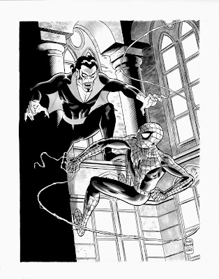
The Living Vampire Meets The Spider Man

Another commish I recently completed. It was a lot of fun drawing Morbius, especially putting him in his retro-70's get-up. I have to admit that I did have a little problem with the composition. It's difficult to feature two characters if they're fighting with each other. The easy solution is to have the characters coming at each other from both sides of the page. In this case though, I was dead set on showing Morbius with his "underwings" outstretched. Even with the composition difficulties, I still like the way this piece turned out quite a bit.

I decided to color the piece as well because I wanted to test out some different approaches to the way I work in Photoshop. I have a project coming up that I'm going to be doing the color on and I was particularly interested in using ink washes with Photoshop to get a more organic feel. I really liked the way the effect worked. Now, this wasn't a perfect test because the original piece was a complete piece and the wash was not applied with the idea that I would be coloring over it. For example, I would not have done a grey wash over all of the red areas of Morbius' costume had I know I would color it. I would've just done some shadows here and there.
Overall, I consider it a successful first attempt. I really like the texture that was created on the stone walls. It almost looks like watercolor but all that was done in Photoshop was a simple gradient.

Thursday, April 05, 2007

Ink Sketch:Tara Chace


Whoops. Found this sketch in my blog archive--apparently I never posted this. (from 12/13/05)

Damned Portrait #3


Cleaning out the blog dust bin and found this. (from 02/27/06)