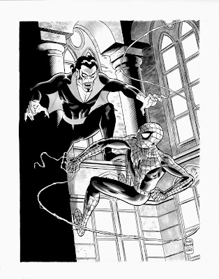
 Another commish I recently completed. It was a lot of fun drawing Morbius, especially putting him in his retro-70's get-up. I have to admit that I did have a little problem with the composition. It's difficult to feature two characters if they're fighting with each other. The easy solution is to have the characters coming at each other from both sides of the page. In this case though, I was dead set on showing Morbius with his "underwings" outstretched. Even with the composition difficulties, I still like the way this piece turned out quite a bit.
I decided to color the piece as well because I wanted to test out some different approaches to the way I work in Photoshop. I have a project coming up that I'm going to be doing the color on and I was particularly interested in using ink washes with Photoshop to get a more organic feel. I really liked the way the effect worked. Now, this wasn't a perfect test because the original piece was a complete piece and the wash was not applied with the idea that I would be coloring over it. For example, I would not have done a grey wash over all of the red areas of Morbius' costume had I know I would color it. I would've just done some shadows here and there.
Overall, I consider it a successful first attempt. I really like the texture that was created on the stone walls. It almost looks like watercolor but all that was done in Photoshop was a simple gradient.


2 comments:
Great stuff as always, brian. That's a hell of a nice commission -- the client must be one lucky dude!
Hey, Bri, that's one super piece of work (as usual). Was it really a commission? Seems like that's something editors should be seeing. How do others (like me) go about getting copies? Just curious.
hrh
Post a Comment