I recently completed a commission for someone featuring Vertigo's character, Death. I've always loved this character, and was especially a big fan of the first mini-series, Death: the High Cost of Living. At the time I was a huge fan of the artist Chris Bachalo. I think at that point he was mainly associated with another Vertigo title, Shade: The Changing Man. He has since diminished a bit, in my eyes, as his art drifted further and further towards a more pop/graffiti style that gives me a headache to look at. Can't blame an artist for growing and evolving, it's just that in this case he move further away from my aesthetic tastes. But, I digress...
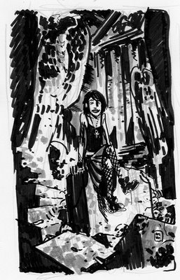
So given this commission I started of by doing this very small, very ruff, marker sketch:
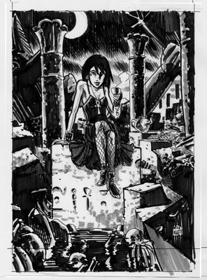
 Being fairly happy with the general composition I moved on to creating a slightly tighter marker sketch done to scale of the final image size. Knowing that I wanted her amongst some decay and ruin I did a little research to find some Egyptian imagery. The columns should be historically accurate and the toppled statue in the background is the Egyptian god, Anubis. To my understanding, Anubis was the guide to the underworld, the one who would sheperd the souls to Osiris, the God of Death. Apparently, early Egyptians worshipped Anubis as the original God of Death before Osiris came along and his position in the pantheon was "downgraded". Of course, I'm kinda talking out my ass here so feel free to correct me if I'm wrong.
 And, the final. Done on 14" x 17 " Bristol board in Sumi ink and grey PITT brush pens. The grey pens were a last minute addition. I had intended to have the image be black and white, but after dong the sketches with grey tones the final just looked like it was lacking something. I had never used the brush pens on an image this large or for something that was going to someone else. I was really afraid that I would mess it up and have to start all over. Fortunately, I think it turned out pretty good.


2 comments:
The finished version is great, and your Egyptian research does you credit, at least to my untutored eye...but that first rough sketch has an energy and a character that really grabs me! Something about the casual pose and the roughly implied expression conveys a vivid personality. And knowing the character and what she represents, it just clicks. The more composed finished piece is something I can admire, but it's the rough sketch that keeps making me smile.
Is this the kind of comment that makes you want to throttle someone?
Is this the kind of comment that makes you want to throttle someone?
Not at all! I hope I didn't respond to this post so late that you won't see it. Your comment is one I get quite often from friends and completely understand it. My ultimate goal is to one day be able to capture the energy and immediacy in my final work that I have in many of my sketches. One of my freinds recently told me he'd like to see me do a whole comic in my loose, sketchbook style. He even went so far as to say I should just draw it in my sketchbook. That might actually help me, psychologically, to loosen up. I find it very difficult to do that in work that has been commissioned or that is to be published. I think I'm plagued with trying to please everyone!
I love feedback like this--keep it coming!
Post a Comment