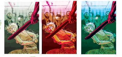
 Here's the cover to the upcoming ish of Q&C. This is a good example of starting off with a clear idea and then through the process coming out with a radically different version. Because I am still SO new to this coloring biz-ness, I had sent out 3 rough color tests (seen below) to a handful of trusted artists friends to get their feedback. It was pretty much split evenly as to which version everyone preferred with two of my friends offering suggestions about how to combine elements of two of the pieces together. I ended up having to rely on my own gut and, love it or hate it, I decided to go with the one I found the least conventional. I felt these colors were more jarring and psychologically disturbing which, in my mind, fit the scene depicted. I also felt the colors better represented the sense of place (Iraq). This has been the most gratifying color work I've done yet--something about working this piece really freed up my thinking about color. I'm really looking forward to my next piece.


3 comments:
Color scheme wise, the cover really brings to mind something by Tomer Hanuka. I couldn't tell you what cover it reminds me of, let alone the series it was from, but something about those colors in that combo scream "Tomer Hanuka". You know, in a good way.
Keep it up Brian, I love watching you develop into this great, multifaceted artist.
Wow, third comment tonight.
You've had a very talented week. I like the fade to red-violet up top. Lots of nice detail added with the color, too.
Your are Nice. And so is your site! Maybe you need some more pictures. Will return in the near future.
»
Post a Comment